
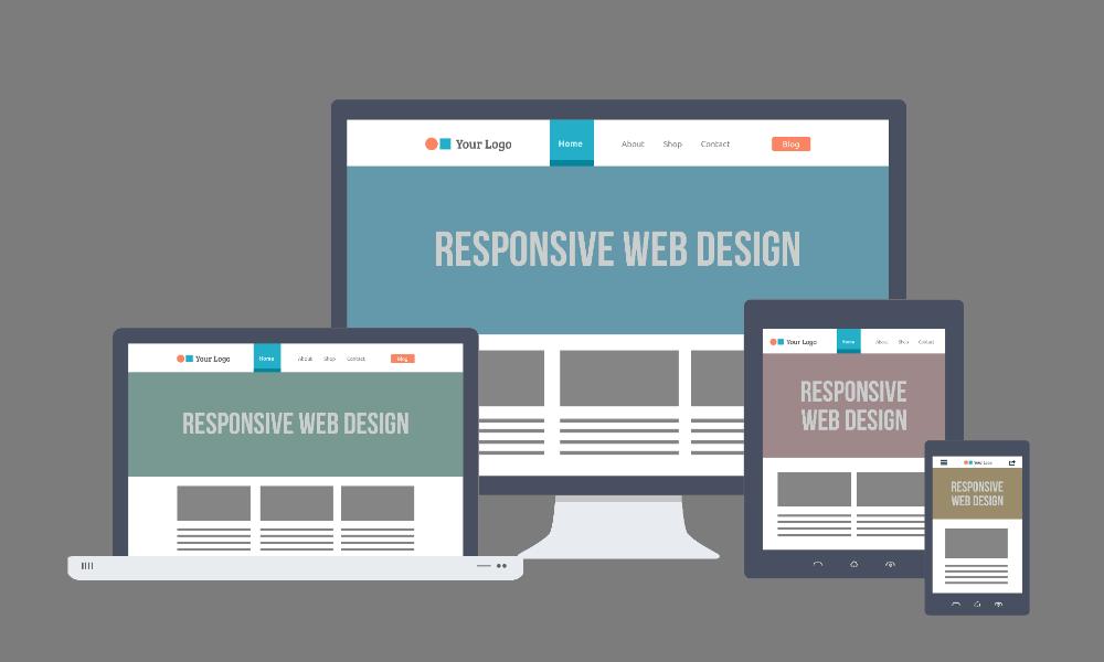
Responsive web design is the most effective approach to meeting the needs of today’s target market. Responsive websites respond efficiently to user requirements based on screen size and device type, automatically adjusting resolution, layout, and sizing as the user switches between screens and mediums.
Building responsive websites benefits small and large businesses alike. It lets small entrepreneurs make a single, effective website compatible with every screen size, cutting the cost of building several separate websites for different devices. Responsive web design is the most cost-effective approach in web design and development today.
For small entrepreneurs, it’s the best way to reach a wider audience. A good, satisfying user experience helps convert visitors into customers. Another benefit is that you only have one website to monitor and maintain instead of several separate versions. When you update or add a new feature, you only need to make changes once and it updates everywhere, including mobile.
Responsive web design also delivers real SEO benefits that help small businesses grow steadily. Google favors responsive websites and recommends them. They reduce the risk of duplicate content issues and help businesses gain higher rankings on mobile search results. With a better user experience, responsive sites also deliver social media benefits — businesses become more popular by being shared and engaged with on social platforms.
The most important benefit of responsive web design is its cost-effectiveness and ease of maintenance. Maintaining a single responsive website with one piece of code, for every device and platform, costs less and takes less time and effort than maintaining separate non-responsive sites.
Although building responsive websites can be challenging, the payoff is real: increased mobile traffic and a better experience for every visitor, whatever device they’re on.